Quality Control is a Company-Wide Matter
In the past, quality control was mainly done in the manufacturing department. They adopted a “scientific approach” method to improve quality in the production process, rather than just looking at the results of the production.
However recently, companies started to notice that the basic concepts of quality control were not only applicable to the manufacturing department, but could also be used to improve operations in other departments. The “scientific approach” method is in other words, “frameworks” or “logical thinking”, which are common to all departments.
The concept of the entire company working together to improve quality is called TQM (Total Quality Management).
In today’s fierce competition among companies, offering good quality and low prices aren’t appealing enough to survive. More importantly, companies are required to create quality that meets the needs of customers in the diversifying market.
To achieve this, quality control must be done not only in the manufacturing department, but also in all departments, including planning, design, production engineering, and sales.
Instead of a bottom-up approach from the frontline, a top-down approach is needed to incorporate quality management into management strategies. However, we must not forget that underlying principles of “frameworks” and “logical thinking” remain the same as before.
What are The Seven New QC Tools?
The “Seven QC Tools” are widely used as quality control tools. Represented by Pareto charts and histograms, it uses statistical methods to analyze numerical and quantitative data.
However, in fields such as management strategy, planning, and sales, we do not only deal with numerical data, but also qualitative data. The Seven New QC Tools are used to analyze qualitative aspects such as linguistic data that cannot be quantified.
The Seven New QC Tools consist of seven methods: affinity diagram, relations diagram, tree diagram, matrix diagram, arrow diagram, process decision program chart, and matrix data analysis.
The Seven Methods
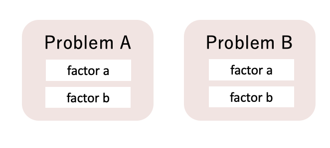
Affinity Diagram
Affinity diagram is a method used for unclear issues such as future problems or unknown problems. It is suitable for organizing disparate linguistic data by affinity and relatedness.
By lumping similar problems together, the overall picture and structure of the problem becomes clearer, and will become easier to tackle the problem.
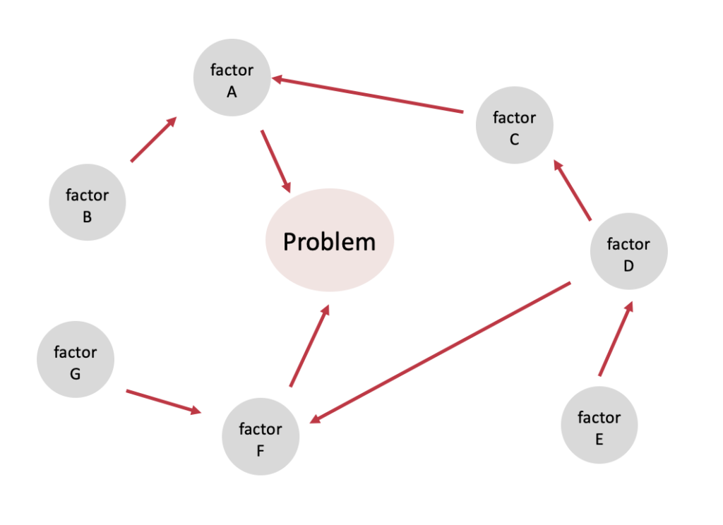
Relations Diagram
The relations diagram is a graphical representation of the correlation between causes and effects that have complex connections. It allows you to unravel the factors that cause the problem you want to solve, clarify the connections among the factors, and see the whole picture from a broad perspective.
The first step in creating a relations diagram is to define the core issue. Next, identify the primary factors that are related to the issue. The diagram is then completed by looking for secondary factors that delve deeper into the primary factors, and connecting the correlating factors together.
If you create this in a group, it will not only make the report more precise by incorporating the knowledge of many people, but also helps to raise the awareness of each individual.
Tree Diagram
Tree diagram is a method of systematizing and developing the measures to achieve an objective in a branching manner. It helps to organize effective measures by creating a clear diagram of the path to achieve the goal.
While the relations diagram method clarifies the structure of the problem, tree diagram allows you to organize what measures should be taken to tackle the problem.
Tree diagram could be created by replacing the measures to achieve an objective with secondary objectives and repeatedly develop it until a viable measure is found.
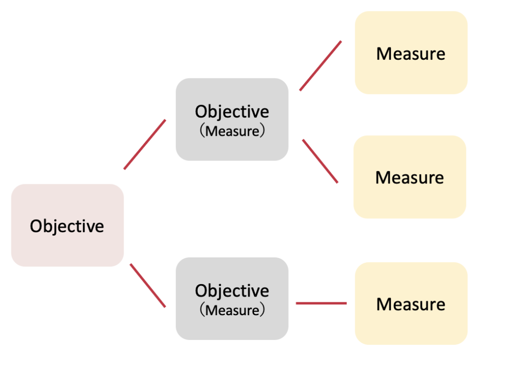
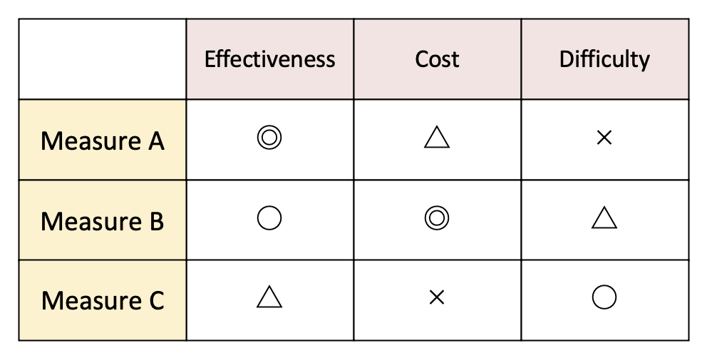
Matrix Diagram
When you identify a number of effective measures using the tree diagram, it is easy to lose sight of which ones should be prioritized. The matrix diagram is a method used to determine the priority and division of the measures developed in the tree diagram.
In the matrix diagram, the elements to be considered are arranged in rows and columns, and the degree of effectiveness is noted at each intersection points of the table.
The advantage of creating a matrix diagram is that it allows you to organize the relationships among the elements and grasp the overall structure at a glance. This is crucial if you want to proceed with problem solving effectively.
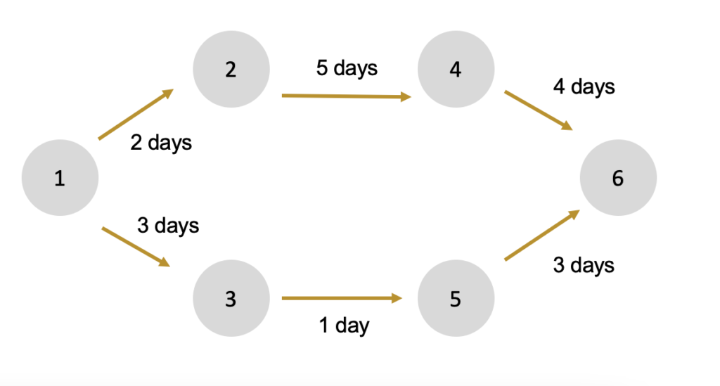
Arrow Diagram
Once the best measures to solve a problem are determined by the tree diagram or the matrix diagram, it is time to consider the order and timing of execution.
Arrow diagrams are used to visualize the schedule and the time required for planning, and to consider how to shorten the time and manage the schedule.
The first step in creating an arrow diagram is to arrange the necessary processes along a time axis. Next, connect each process with arrows and write the number of days required for each process. Be cautious about whether the order of the tasks are correct and that the number of days required are realistic.
Arrow diagrams make it easier to control the progress and see if it is going as planned and how much delay is acceptable.
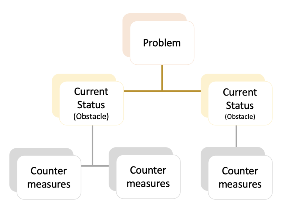
Process Decision Program Chart
Process decision program chart, abbreviated as PDPC, is a method of guiding the progress of a process in a desired direction by predicting various obstacles that may occur before reaching the goal and showing how to avoid them in a diagram.
By predicting the obstacles before starting the planning process, countermeasures can be taken in advance. In addition, the PDPC has the advantage to facilitate cooperation and coordination with related parties.
Matrix Data Analysis
The matrix data analysis is a technique which numerical data are used to statistically analyze the data, represented in a planar diagram.
It easily visualizes the relationship between the problem and the factor. It is considered as a principal method in analysis in statistics. This is the only method that deals with numerical data among the Seven New QC Tools.
Tips for Using the Seven New QC Tools
Unlike the Seven QC Tools which deal with numerical values, the Seven New QC Tools deal with the ambiguous concept of verbal data.
Numerical data is an objective fact that is clear to everyone. However, linguistic data can be interpreted in many different ways, therefore, may not be true. In order to prevent such misinterpretation, it is important to proceed under the three promises: actual place, actual thing, and actual reality (in Japan called “Sangen Shugi”). Try to verbalize the facts without guesswork.
The Seven New QC Tools are highly effective when worked on by multiple people. This is because in the process of analyzing verbal data, new ideas may be generated from the opinions of others.
The Seven New QC Tools can be used not only to improve manufacturing sites, but also as a source of creativity, and should be actively incorporated into management strategies.
(Photos from Photo AC)